Han Jiaying
Mr. Han Jiaying, a renowned designer from China, was born in Tianjin in 1961, and graduated from Xi'an Academy of Fine Arts in 1986. In 1993 he founded Hanjiaying Design and Research Institute Limited,and now he is the visiting professor and thesis advisor at the School of Urban Design of the Central Academy of Fine Arts. He is also one of the co-founders of the International Creative Arts Alliance (ICAA), and the vice president of the Academic Committee of the ICAA, during the founding of which he has provided tremendous amount of help.
He has won multiple domestic and international awards, including the golden award of the Graphic Design in China, the golden award of the Design 2000 Show by the Hong Kong Designers Association, the golden award of the Design for Asia Awards, and the bronze award of the International Poster Triennial in Toyama. For the past 20 years, he has contributed to the successful brand image of top enterprises such as Vanke, China Merchants Bank, Konka, and C’estbon. From 2012 to 2014, the Reflection· Han Jiaying Design Exhibition toured the OCT Art & Design Gallery in Shenzhen, the Art Museum of the CAFA, and the Rockbund in Shanghai. It was the first solo exhibition of a professional graphic designer from mainland China. In 2012, he was appointed the curator for the first China Design Exhibition. In 2014, he became the visual creative director of the HK-SZ Design Biennale. He is a member of AGI, D&AD, and also ADC. In 2015, he landed on the list of the Most Influential Designers in China by Forbes.
From the career of Mr. Han Jiaying, we can discern his learned and scholarly style, his deeply ingrained Confucianism, and his sense of social responsibility, all of which combine to exert a profound influence on his works.We can also discover a seamless integration of traditional Chinese culture into fashion, and of commercial motives into the pursuit of art. His insight in Chinese characters demonstrates his learned understanding about eastern philosophy, while in the meantime transcends local culture by utilizing a more westernized approach towards designing, which offers a unique interpretation of traditional Chinese culture. He has greatly contributed to the successful brand image of a series of top enterprises in China, covering a wide range of industries including financial sectors, urban tourism, museums, real estate sector, food and beverage industry, culture and media, and automobile industry.
Repsentative Worksre

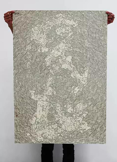
Celebrate Our Planet
Theme poster exhibition of the fête dugraphite, Paris, 2015
In January, 2015, Mr. Han Jiaying was invited to Celebrate Our Planet, the theme poster exhibition of the fête du graphite, organized by the Ministry of Culture and Communication along with the mayor of Paris. Countless stars and planets have been perambulating around in the universe, among which is the Earth, a tiny dot for the boundless space, but the whole world for us. The subject of the poster is the oneness of the various phenomena on the sphere of the planet earth; therefore it choses the Chinese character phenomenonas its framework, onto which the various phenomena in nature are added, and Taihu Stone is morphed into it in the style of Chinese brush painting. It symbolizes the harmonious coexistence among nature, humanity and society with modern design techniques, communicating rich layered beauty.
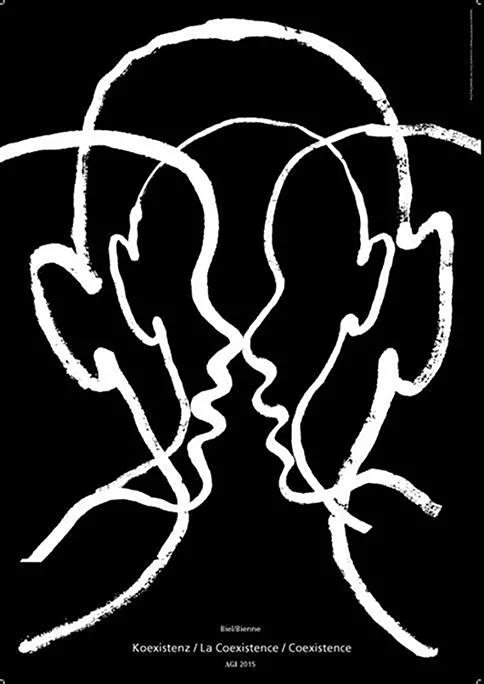
Coexistence
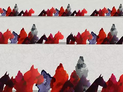
Posters for the AGI Congress in Biel, Switzerland
In Sept. 2015, Mr. Han Jiaying was invited to the AGI Congress titled coexistence, which got its name through the host city, Biel/Bienne of Switzerland, a city where people of an array of ethnicities, nationalities, and races coexist and speak both Germanand French. The poster builds on this idea, and conveys the unique to lerance of this city as well as people’s wish for peace, through its recreation of people of different attributes from different angles.
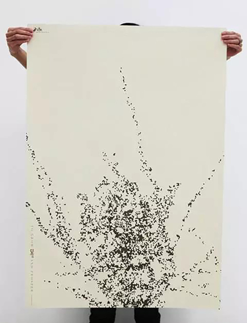
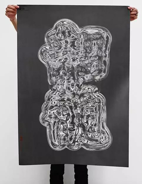
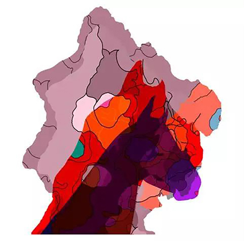
Ingenuity Follows Nature
Theme posters
The creation of the poster Ingenuity Follows Nature in 2011 was a transcendence from thoughts of natural philosophy. With the application of modern design techniques, it connotes the aesthetics of the form and meaning of Chinese characters, exhibiting the cultured beauty of the calligraphy as well as its firmness and flexibility. yuan rong, meaning the willingness to compromise, is the wisdom of the enlightened. Things are like interlaced threads and webs, while the characters yuan rong are meshed within. An enlightened heart could appreciate everything under the sun. Sheng sheng is about the way of change. It utilizes the characters sheng sheng as the germ and allows trees to grow vigorously from it, assuming a new form of life before they go on to prosper. Jing guan is the beauty of emptiness. Its simple but powerful strokes express the idea of inner peace, through a kind of natural beauty limpid like amber and spring water. Zi zai is a natural way of releasing. Viewed horizontally, it is mountains moving;vertically, it is sands blowing, a recreation of the beauty of nature.


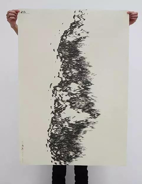
Forms of Words on Heaven and Earth
Theme posters、books、installations
This series of posters Forms of Words on Heaven and Earth experiments with the idea of using the basic elements of design, namely the dots, lines, and geometric shapes, in combination with Tao Te Ching, I Ching,and Liturgy of Bodhi, the three classic schools of ancient chinese philosophy,to explore the many possibilities of the design of chinese characters. It brings out the aesthetics of the Chinese characters, and is a tribute to chinese philosophy in the artistic form of graphic design. The series of works has won GDC Exploration & Experiment Best Awards in 2011.
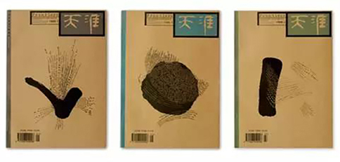
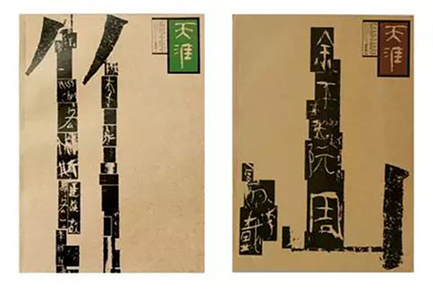
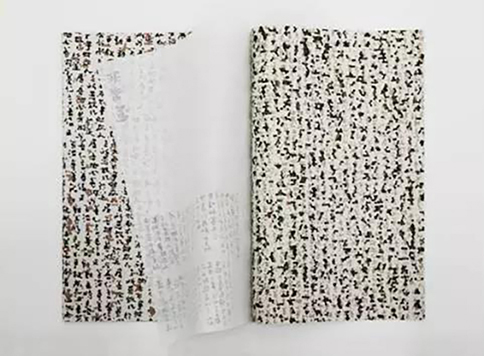
Tianya Magazine
As a cultural magazine, Tianya needed to express itself in acultural way. Mr. Han Jiaying gave it its unique brand positioning based on its cultural characteristics, by designing its cover in a symbolized way that dissected and interpreted the culture. In the years in which he matured alongside with Tianya Magazine, he gradually developed his own system of design ideology and style. In the cover design of Tianya Magazine and its serial promotional posters, the hieroglyphic and connotative nature of Chinese characters, processed by thinking and modern design devices, incorporates Chinese characters and characteristics of eastern civilization into modern visual and artistic culture.With its unique perspective, the visualized expression carried out for Tianya Magazine has brought to the contemporary design industry a new approach,endowing traditional graphics with concepts that are both concrete and abstract. The Tianya series is now in the collection of the Museum of Design in Zürich and Museum of Arts and Crafts in Hamburg, Germany.
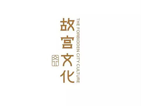
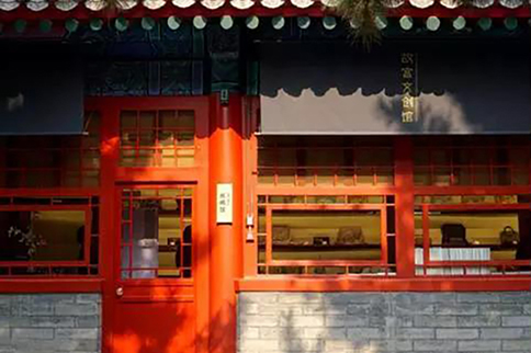
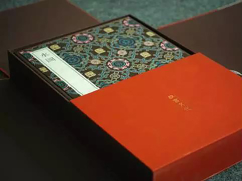
the Forbidden City Culture
Brand Image
The culture within the Forbidden City is the quintessence of the Chinese culture, the philosophy behind which is rich with a long history.As a cultural and creative brand that epitomizes the national culture, The Forbidden City Culture, full name Beijing Forbidden City Culture Communication Co., Ltd, is the heir to the traditional Chinese classics, and also the preacher of traditional way of life. It is an institution affiliated with the Palace Museum that communicates culture, with its mission to be a messenger for traditional Chinese culture and Chinese spirits. The Forbidden City Culture has relayed the cultural heritage of the Chinese civilization that has been passing on for thousands of years, and preserved the royal collection of six hundred years’ worth of artwork and artifacts. As for the cultural and creative brand Forbidden City Culture, it is an attempt at visualizing the cultural content.
The design of the logo takes the traditional seal characteras the framework, in combination with the cornice of the Forbidden City architecture and Chinese style slim table. It is a simplified and modernized design strategy, which combines the charm of the traditional fonts and classic designs in the Chinese culture. It differs from the calligraphy of the version by Mr. Guo Moruo. It is classic, with modern flavor. The English words on the logo are a modern sans serif typeface, in vertical text, an integration of eastern and western style. The design of both Chinese and English text is a modern interpretation of classics, which speaks the heart of the brand purpose of the Forbidden City Culture.
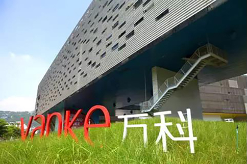
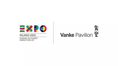
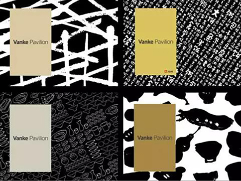
Vanke& Vanke Pavilion of Milan Expo
Brand Image
On May 1, 2015, the opening ceremony of the Vanke Pavilion of Milan Expo commenced. In front of this pavilion of a unique coiling dragon shape, Vanke Group officially announced its new corporate logo. The new corporate logo was designed by Mr. Han Jiaying. It consists of the five letters VANKE, without graphics, just the Chinese and English words.The corporate slogan is also changed from to celebrate life with architecture, to to celebrate life and tobuild cities. The newly released corporate logo is a joint effort between the senior management and Mr. Han Jiaying. It abandons the use of graphics in logo design and makes it entirely with text, which underscores the corporate brand itself. The combined use of upper and lower case letters also helps establish rapport between the corporate and the public. Visually, it is exuberant with youth. From the perspective of design, as we are ushered into a new era where people’s taste is constantly evolving, the attempt at minimising the corporate logo of Vanke caters to the demand of both the corporate and the market.
Other representative works

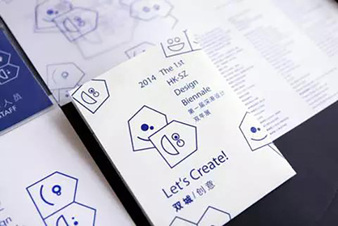
The First HK-SZ Design Biennale
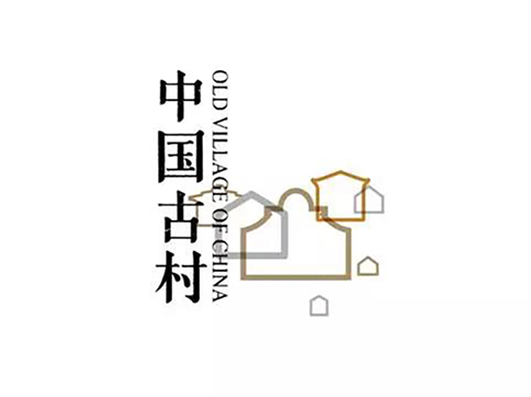

The China National Conference on Old Villages
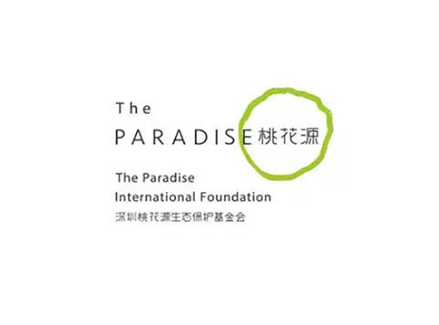

Paradise International Foundation
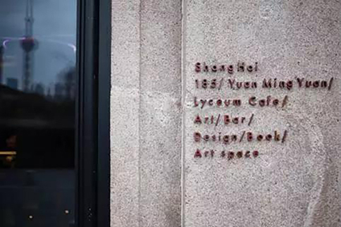
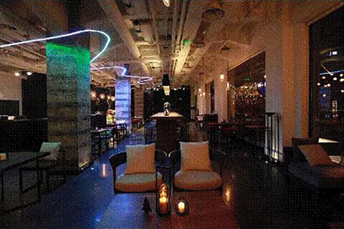
Lyceum Cafe
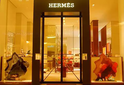
the Beautiful Escape of Hermes

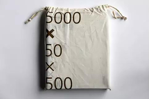
《Han Jiaying 5000x50x500》
For Mr. Han Jiaying, it is an intimate relationship between fashion, business and art. They inspire each other and motivate each other. He reminds us, with his works, that culture is in the end created by the people that live within the culture, and while business culture is but a component, it is nonetheless a means to create our culture. The role of designers is not just to create culture, but to bridge the gap between culture and business, and also to make the fashion trends a mirror of the evolvement of culture.
Flat D, 13 Floor , Sing Teck Factory Building, 44 Wong Chuk Hang Road, Hong Kong
00852 27965068
00852 27965068
info@icaalliance.org